
How RentalSetup Works to Make Rental Websites ADA Compliant
Screen readers, contrast on built-in pieces like the cart badge, and the WCAG checks behind each fix
Updated:
Table of Contents
RentalSetup takes visually impaired customers seriously, and we take seriously the fact that many of them depend on a screen reader. We put effort into the standards the accessibility industry uses, and we apply those standards throughout the site. That includes things that come built in, such as the shopping cart badge, so the contrast is already in good shape before a rental business customizes anything.
The standard those reviews measure against is the Web Content Accessibility Guidelines, WCAG 2.1 and 2.2. Level A is the baseline. Level AA is the level most accessibility audits and website discrimination complaints cite. A passing check is a numbered success criterion: a contrast ratio, a text alternative on an image, a name on a button, or a label connected to a form field.
Readable text and named controls help a blind or low-vision customer finish a booking. They are also the gaps those complaints usually name. When a rental business tells us a screen reader cannot tell what a control is, we implement the check and ship it. The sections below pair each standard with the way RentalSetup met it.
The check to pass, and how RentalSetup implemented it
- 1.4.3 Contrast (Minimum), Level AA. Normal text at least 4.5 to 1. Large or bold text at least 3 to 1. The header phone number and the cart badge were updated to clear 4.5 to 1.
- 1.1.1 Non-text Content, Level A. Every meaningful image needs a text alternative. The elegant-header logo uses the Text Logo as its alt. Page images get alt text in the editor. Footer social icons ship with a real alt.
- 2.4.4 Link Purpose and 2.5.3 Label in Name, Level A. A control’s accessible name has to say what it does and include the words on the screen. Select and the quantity plus and minus buttons now include the item name.
- 1.3.1, 3.3.2, and 4.1.2, Level A. A form field needs a label that is programmatically connected. Name, email, phone, delivery address, the typed address fields, and the Check Availability dates use a matching for and id.
- 1.3.1 and 2.4.6 Headings, Level AA. Heading levels should not skip. Footer section titles are level 2. The sticky price line and the cart total are paragraphs, so they stay out of the heading list.
The shopping cart badge is built in, and it had to pass contrast
The number on the cart icon is small text, about 12 pixels. Under WCAG 1.4.3 that size needs a contrast ratio of at least 4.5 to 1. The badge shipped as white text on pure red. That pair is about 4.0 to 1. A contrast checker reports it as a failure, and it is hard to read for someone with low vision.
RentalSetup changed the built-in badge to a darker red, #C62828. White text on that red is about 5.6 to 1, which clears 4.5 to 1. The cart icon stays red. The count is the part that changed. This is not a setting the rental business has to find. The same darker badge is on the elegant header, the bounce house header, and the plain header.
WCAG 1.4.11 also asks user-interface parts, including icons, to clear 3 to 1 against what sits behind them. The darker badge clears that bar as well as the stricter text rule for the digits.
Phone number contrast, and headlines on a photo
On the Ocean Breeze header, the phone number was a light blue (#0277BD) on a light bar (#B3E5FC). That pair is about 3.5 to 1. The phone icon uses the same color as the digits, so the icon failed with the number. The slogan on that bar was already a darker blue, #01579B, at about 5.5 to 1. The phone color is now that same dark blue, so the digits and the icon pass 1.4.3.
A homepage headline in white on a photograph is a different contrast problem. A checker often reports 1 to 1 because it cannot see the photo as a background color. Large bold text needs 3 to 1, and the smaller line under the headline needs 4.5 to 1. In the page editor, highlight the words and use the paint bucket so the text sits on a solid dark color. That gives the words a background the contrast rule can pass. The product page editor guide shows the hero banner those headlines live in.
The logo image description is the Text Logo
WCAG 1.1.1 says a logo needs a text alternative that names the business. On the elegant header, the image logo’s alt is the Text Logo. A new site starts with the subdomain in that field, so a screen reader says the subdomain — certifiedrental — instead of the business name. An image logo does not replace that description. The Text Logo screen says the words will not display when an image exists. On the elegant header those words are still what the screen reader reads.
Change it from the header settings:
- Log in and click Admin at the top.
- Click Customize header.
- Open the Text Logo tab on the left.
- Replace the subdomain with the business name, for example Certified Party Rentals & Events.
- Click Submit text logo, then refresh the public site.
The assets doc shows the Text Logo field and a screenshot of where you type the business name: change the text logo. That same page is where you upload the logo image.
Footer social icons are a built-in version of the same rule. Facebook, Instagram, and the other networks are images with alt text, so a screen reader announces the network name.
Alt text on images in the page editor
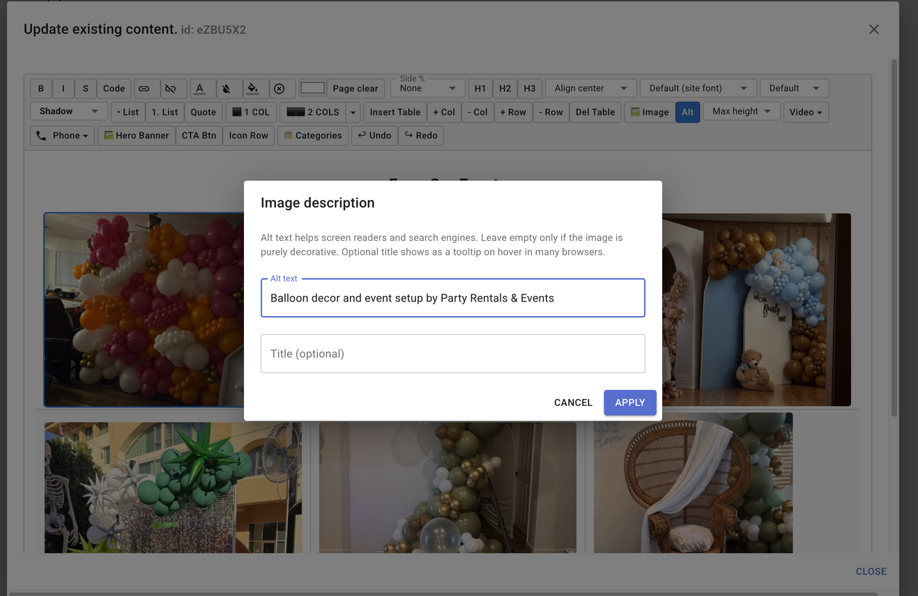
The same 1.1.1 rule applies to photos you place in a page. In the page editor, click the image, then click the Alt button in the toolbar. The Image description dialog opens so you can type what is in the photo.
- Click the image in the editor so it is selected.
- Click the Alt button next to Image in the toolbar.
- In the Image description dialog, type the alt text. A useful description says what is in the picture, for example: Large brownish wicker throne chair with a decorative drape laid diagonally over the back.
- Leave alt text empty only when the image is decorative and adds no information.
- The title field is optional. Many browsers show it as a tooltip. It is not a substitute for alt text.
- Click Apply.
The same dialog also opens right after you upload a photo with the Image button. To change the description later, click the image again, then click Alt.
Product photos have their own alt text as well. The bounce house SEO guide shows that field and why the description helps both screen readers and search: image alt text in the SEO guide.
Aria-labels so screen readers know which item
WCAG 2.4.4 says the purpose of a control has to be clear. WCAG 2.5.3 says the accessible name has to include the visible text. On a product with several options, every button can say Select. A person looking at the page sees the variant name above the button. A screen reader does not get that context from a nearby heading. It hears “Select” over and over and cannot say which bounce house, slide, or package the button chooses.
We keep the visible word Select. We add an aria-label that includes that word and the item name, so the accessible name matches what is on the screen and then says which option it is. After the customer selects it, the same button is announced as Deselect plus that item.
<button aria-label="Select 18-foot waterslide">
  Select
</button>
Quantity works the same way on a solo price table and on a variant that has its own price table. A plus sign and a minus sign are not enough when a page has more than one quantity control. The decrease button, the number field, and the increase button are each named for the item: decrease quantity, quantity, and increase quantity, followed by the product name or the variant description.
An aria-label is for the screen reader. It does not replace text a sighted customer needs to see. When the words should be on the page — “Phone number,” “Delivery address” — we show them, and we connect them. We use an aria-label when the visible control is a short word or a symbol that would otherwise all sound identical.
Labels connected with for and id
WCAG 1.3.1, 3.3.2, and 4.1.2 require the visible label to be tied to the field in the markup. A label sitting above a box is not enough. The connection happens when the input has an id and the label’s for attribute is the same id. Without that pair, a screen reader can land in the box and never say “name,” “email,” or “start date.”
Checkout now connects the customer’s name, email, and phone number. The phone field used to offer only a placeholder, (123) 456-7890. Placeholders are hints. They are not the name of the field, and they vanish while someone types. The field now has a visible Phone number label. The country flag beside it already announces itself as the phone-number country.
<label for="customer-phone">Phone number</label>
<input id="customer-phone" type="tel" placeholder="(123) 456-7890" />
The address box on the delivery step had the same gap: a placeholder that said to start typing, and no word “Address” tied to the input. Delivery orders now show Delivery address. Pickup orders show Address. If the customer switches to the typed address form, Address 1, Address 2, City, State, and Zip Code are connected the same way.
Check Availability dates are connected too. Start Date & Time and End Date & Time each have an id that matches their label, so a screen reader can tell the two datetime fields apart.
Heading order a screen reader can follow
WCAG 1.3.1 asks the structure of the page to be in the markup, not only in the font size. WCAG 2.4.6 asks headings to describe the section. Footer titles such as Delivery Areas, Contact Info, and Follow Us were level-6 headings. After a page that starts at level 1, a jump to level 6 skips the levels in between. Those titles are now level 2. They look the same size as before.
On the product page, “Rent this starting at…” and “Total” were also headings. A person moving by headings would land on the price instead of the next section. Those lines are paragraphs now. The price is still on the page. It is no longer in the heading list.
When a customer says a screen reader needs a fix, we do it
A rental business, or someone testing the live site, tells us what the screen reader failed to say. We look at the markup and implement the matching check. A label that is visible but not connected gets an id. A button that only says Select gets an aria-label that includes the visible word and the item. A contrast failure on a built-in piece, such as the cart badge or the header phone number, gets a darker color.
That is how this set of fixes landed: the cart badge, the header phone color, footer social-icon descriptions, footer heading levels, the product price lines, variant Select buttons, quantity plus and minus on solo price tables and on variants with price tables, checkout name, email, and phone, the delivery address and the typed address fields, and the Check Availability start and end dates. If the next report is another unnamed control, we name it the same way.
Test a page on the site you built
After the site is live, open the WAVE AIM score (https://wave.webaim.org/aimscore). WebAIM is a nonprofit at Utah State University. Paste the address of a page on the rental site — the homepage, a product page, or checkout — and WAVE reports an Accessibility Impact (AIM) score from 1 to 10. A 5 is about average for home pages on the web. The score looks at how many errors the tool can detect, how dense those errors are, and how many alerts it raises.
Use that report to see contrast, missing alternative text, and fields that are not connected to a label. WebAIM is clear that a high AIM score is not, by itself, proof the page meets every accessibility guideline. Someone still needs to move through the page with a screen reader. If the report shows a problem on a part RentalSetup provides, tell us and we will match it to the standard.
Frequently Asked Questions
Which accessibility standard is this work measured against?
The Web Content Accessibility Guidelines (WCAG) 2.1 and 2.2, Level A and Level AA. Those are the checks accessibility reviews and most website discrimination complaints use. This article names the success criterion and the change RentalSetup made for it.
Why was the shopping cart badge changed?
The count is small text, so WCAG 1.4.3 asks for a contrast ratio of at least 4.5 to 1. White digits on pure red are about 4 to 1, which fails. The built-in badge is now a darker red, #C62828. White on that red is about 5.6 to 1. The same badge is on the elegant header, the bounce house header, and the plain header.
How do I change the description a screen reader reads for my logo?
On the elegant header, the logo image alt is the Text Logo, even when an image is showing. Log in, open Admin, choose Customize header, open the Text Logo tab, and replace the subdomain with your business name. Submit, then refresh. The assets doc shows that Text Logo field and the screenshot. Change the text logo.
Where do I add alt text to an image in the page editor?
In the page editor, click the image, then click the Alt button in the toolbar. The Image description dialog opens. Type the alt text and click Apply. The bounce house SEO guide also shows alt text on product photos.
How can I test a page on the site I built with RentalSetup?
Open the WAVE AIM score from WebAIM, a nonprofit at Utah State University, and enter the address of a page on your rental site. The score runs from 1 to 10. A 5 is about average compared with home pages on the web. It is based on detectable errors, how dense those errors are, and alerts. A high score is a useful check. It is not, by itself, proof that the page meets every accessibility guideline. Manual testing still matters. WAVE AIM score (https://wave.webaim.org/aimscore).
What if a customer says a screen reader still misses something?
We treat that as a fix. If a rental business tells us a button, a date field, or an address box is not announced, we add the name or connect the label. That is how the Select buttons, quantity controls, phone field, address field, and Check Availability dates were updated.
Bookings everyone can finish
An ADA-minded rental website is one a blind or low-vision customer can move through: readable text, buttons that say which item they control, and fields that announce their own names. Doing that work also takes away the gaps that show up in discrimination complaints.
RentalSetup will keep making those changes as customers point them out. If something on your site still is not announced, tell us. We connect the label or name the control.
Put your rentals on a site customers can book
Free to start. The same product pages and checkout are where these accessibility fixes ship.
Related Articles
RentalSetup
The easiest way to build your rental business website. Get started for free.
Legal
Privacy Policy© 2026 RentalSetup. All rights reserved.